Feature Details
All aspects of the login interface for SwiftPOS Touch have been completely redesigned without removing any previous functionality. The new interface has been applied to both the standard and fast login screens and makes the experience seamless and intuitive without overwhelming the user with information. The design puts focus onto the SwiftPOS logo and the SwiftPOS colours of red and blue. Buttons are displayed on an as needed basis, keeping the interface clean and free of distractions
User Experience (UX)
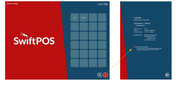
With a wizard style process, the new interface makes the login process intuitive and easy. The design focused on removing all unnecessary information, only adding in information that the user needs to be aware of. For example, if the Touch terminal goes offline the information button in the right-hand corner will go red indicating there is an issue that needs to be resolved. By tapping it, the issue details are displayed so the appropriate action can be taken. Other operational alerts that do not require immediate action such as “orders pending” and “updates pending”, appear in the top left corner.

User Interface (UI)
Standard Login The standard login interface will primarily look as below, with function buttons on the bottom and the time and change (from the last sales transaction) displayed in opposite corners. Enter ID: Requires all staff to enter their ID. If a PIN is also required, this can be entered by selecting the left arrow button. Clock In and Out: If enabled, the clock in and out button shows in the bottom left corner for staff to directly access without having to log in. Print: Once a sales transaction has been committed the print button will appear, allowing staff to reprint the last sales transaction. Change PIN: The change PIN button allows staff to change their PINs. This requires them to enter their old PIN before setting a new PIN. Information: The information button will always display in the bottom right-hand corner showing terminal and venue information including support contact details.
User Interface (UI)
Fast Login The fast login interface will primarily look as below, with function buttons on the bottom and the time and change (from the last sales transaction) displayed in opposite corners. Staff Tiles: There are 24 staff tiles for staff to assign themselves to. To assign a tile, staff simply select a free tile and follow the login process. Once logged in the tile will display their name. Clock In and Out: If enabled, the clock in and out button shows in the bottom left corner for direct access without staff having to log in. Print: Once a sales transaction has been committed the print button will appear, allowing staff to reprint the last sales transaction. Log off: Tapping the log off button will highlight it. Staff can then select their name to log themselves off. Once logged off the log off button is no longer highlighted. Information: The information button will always display in the bottom right-hand corner showing terminal and venue information including support contact details.

